I know it's crude but it's the best I can do with the little free time I have. I'm sure you guys get the point.

| The Breitling Watch Source Forums https://breitlingsource.com/phpBB2/ |
|
| AMOC Graphic Contest! https://breitlingsource.com/phpBB2/viewtopic.php?f=21&t=7943 |
Page 2 of 3 |
| Author: | NavitimerNut [ Tue Mar 03, 2009 3:36 pm ] |
| Post subject: | Re: AMOC Graphic Contest! |
I'm currently designing one too. |
|
| Author: | johnylove [ Tue Mar 03, 2009 4:50 pm ] |
| Post subject: | Re: AMOC Graphic Contest! |
I know it's crude but it's the best I can do with the little free time I have. I'm sure you guys get the point.
|
|
| Author: | Roffensian [ Tue Mar 03, 2009 4:55 pm ] |
| Post subject: | Re: AMOC Graphic Contest! |
I love the bird on that one - not sure about the typo Mario's bird looked like a sports team logo, but that looks real classy. Add Mario's border and I think you're onto something. Of course I have no vote and have no idea how you split the prize - guess I'll shut up now............. |
|
| Author: | johnylove [ Tue Mar 03, 2009 5:11 pm ] |
| Post subject: | Re: AMOC Graphic Contest! |
hahaha. It was late at night and I was sleep deprived when I did it, but good catch. I'm laughing all the way to bed. |
|
| Author: | aleister [ Tue Mar 03, 2009 9:03 pm ] |
| Post subject: | Re: AMOC Graphic Contest! |
I love that logo and I think that if you correct the typo it is then perfect. The sketchy circles and the handwritten text is just beautiful together with the "perfection and heart" and the bird. Nice "double" meaning too - the periferi might be as it is, but when it comes to the important stuff then it matters. |
|
| Author: | johnylove [ Wed Mar 04, 2009 5:59 am ] |
| Post subject: | Re: AMOC Graphic Contest! |
Ok so I tweaked it a bit. I think this is a better entry.  Me personally, I like the way the font plays off the style of the eagle plus the colors give it a bit of punch. I hope you guys enjoy it. |
|
| Author: | johnylove [ Wed Mar 04, 2009 6:25 am ] |
| Post subject: | Re: AMOC Graphic Contest! |
looking at it, i think i might have to get that tatooed somewhere on my body.  
|
|
| Author: | Roffensian [ Wed Mar 04, 2009 7:01 am ] |
| Post subject: | Re: AMOC Graphic Contest! |
Well again I have no vote - but I love that. Not sure about the tattoo though - actually yes, I am sure about the tattoo |
|
| Author: | In2Deep [ Wed Mar 04, 2009 9:57 am ] |
| Post subject: | Re: AMOC Graphic Contest! |
I like the tattoo styled bird as well. My only suggestion would be not to leave so much while are in the logo. We can start playing with different shapes for the logo as well. This one is more elliptical vs round. The Phoenix in the middle is something I made long ago, but can probably work here too. Again, this is all done in Illustrator so it's vector based and will translate well into stickers, silkscreening embroidery etc. I'm just using a generic font, this too can be changed up quite easily. |
|
| Author: | mah [ Thu Mar 05, 2009 3:50 pm ] |
| Post subject: | Re: AMOC Graphic Contest! |
Pretty cool Mario, |
|
| Author: | Tim S [ Mon Mar 09, 2009 12:48 am ] |
| Post subject: | Re: AMOC Graphic Contest! |
I think they're both excellent. Very creative 
|
|
| Author: | Sharkmouth [ Mon Mar 09, 2009 6:04 am ] |
| Post subject: | Re: AMOC Graphic Contest! |
Please find below my submission for the AMOC graphic contest. I thought this was a tricky project as we are not allowed to use the word "Breitling", their logos or watches. Therefore, to represent Breitling in the design, I have used a silhouette of a Lockheed L1049 Super Constellation, an aircraft sponsored by Breitling which flies in their livery.  To represent Andrew Michael, I have used the jewel from the AMJ logo plus a military style typeface to reflect the association the company has with the armed forces. Since both"Michael's" and "Michaels" is used on the web site, I have used the apostrophe version which is in the logo at the top of their page.  Here's my morning's work... Logo 1 - simple banner style use of basic design elements 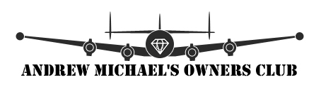 Logo 2 - circular design 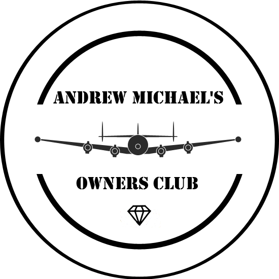 Logo 3 - developing the theme but rather sparse looking 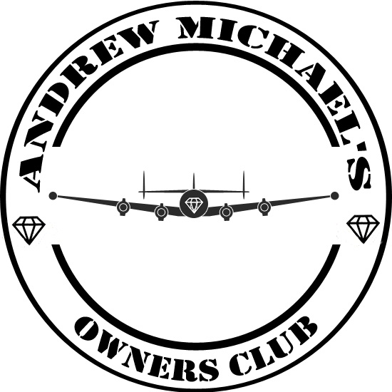 Logo 4 - a variation using text effects to suggest the aircraft is flying towards you 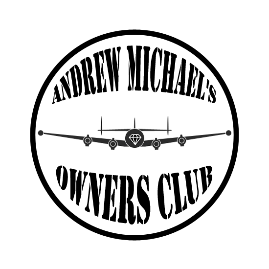 Logo 5 - using the AMJ logo jewel to represent a clock face 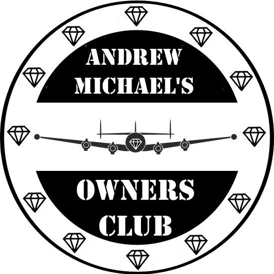 Hope you like them! Sharkmouth
|
|
| Author: | Garfield411 [ Mon Mar 09, 2009 6:05 am ] |
| Post subject: | Re: AMOC Graphic Contest! |
The eagle and the connie are nice designs. Great job! |
|
| Author: | aleister [ Mon Mar 09, 2009 6:10 am ] |
| Post subject: | Re: AMOC Graphic Contest! |

|
|
| Author: | the_whizzler [ Mon Mar 09, 2009 11:49 am ] |
| Post subject: | Re: AMOC Graphic Contest! |
sharkmouth's logo number 4 gets my vote! |
|
| Page 2 of 3 | All times are UTC - 8 hours |
| Powered by phpBB® Forum Software © phpBB Group https://www.phpbb.com/ |
|